
How to Choose Lipstick Colors for a Private Label Collection
Choosing how to choose the perfect lipstick color gets serious when five pretty swatches become 5,000-unit bets. Your palette has to sell, reproduce cleanly, and earn a reorder.
Skin tone, undertone, local tastes, finish, and trend heat all matter; so do SKU overlap and batch consistency. One runaway red cannot carry a confused lineup.
Circana reported 2025 U.S. prestige beauty sales reached $36 billion, supporting disciplined sourcing.
Key Points for How to Choose the Perfect Lipstick Color
➔ Match Undertones: Map warm, cool, and neutral undertones across your target skin tones to ensure shades flatter every complexion.
➔ Balance Depth & Finish: Control pigment concentration, chroma, and opacity, then select matte or satin finishes aligned with your brand’s aesthetic and consumer preferences.
➔ Validate Performance: Swatch test across diverse skin tones and run stability, wear-time, and transfer-resistance trials for consistent, high-quality results every batch.
How To Choose The Perfect Lipstick Color For Branding
Learning how to choose the perfect lipstick color starts with people, not swatches. A strong private label range connects flattering color choices with customer habits, memorable branding, reliable production, and easy shade selection.
Aligning Shades with Your Target Skin Tone and Undertone
Start shade matching with the intended complexion range, then test each hue on real users rather than relying only on lab drawdowns.
-
Warm undertone
- Golden, peach, and olive notes often suit coral, terracotta, and warm red.
-
Cool undertone
- Pink or blue-leaning skin tone profiles can pair well with berry and blue-red shades.
-
Neutral undertone
- Balanced colors create flexible options across several skin depths.
This practical map makes learning how to choose the perfect lipstick color much less hit-or-miss. For brands exploring shade development, Topfeel Beauty provides color matching services to help align formulations with intended undertones.
Reflecting Lifestyle and Beauty Aesthetic in Your Palette
A customer’s lifestyle shapes what feels wearable. Office-focused buyers may prefer soft nudes and satin finishes, while a fashion-led target audience may seek punchy berries or metallic effects.
Build the palette around a clear brand identity and aesthetic, but leave room for a seasonal trend or fresh mood. Each collection should still feel related. For brands exploring cosmetic lines, Topfeel Beauty offers private label solutions to help translate aesthetic ideas into commercially focused lipstick options.
Leveraging Color Depth and Saturation for Brand Recognition
-
Core signature
- Set a repeatable color depth and saturation range.
- Control pigment levels for recognizable vibrancy.
-
Shade distinction
- Adjust intensity enough to prevent near-duplicates.
- Define opacity and finish so every shade has a clear role.
Done well, lipstick color selection becomes part of brand recognition, not just another shade chart.
Ensuring Batch Consistency and Quality Control
- Set an approved color standard for each formulation.
- Control raw materials and pigment dispersion during manufacturing.
- Compare every batch against approved references.
- Use stability testing to detect color shifts over time.
- Record results through routine quality control.
That repeatable process protects consistency, helping the chosen color look right from sample approval to later production runs. As a private label cosmetic supplier, Topfeel Beauty maintains documented quality control procedures during the manufacturing process.
5 Steps To Curate Your Ideal Shade Assortment
Learning how to choose the perfect lipstick color starts well before picking reds or nudes. A smart assortment connects customer needs, color science, current demand, and real-life use, helping private label brands build shades people will actually wear.
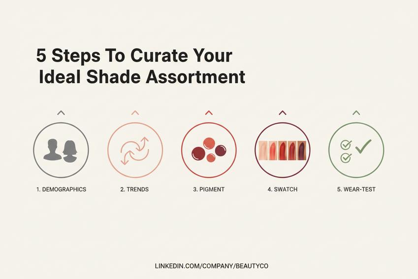
1. Analyzing Consumer Demographics: Age Group & Cultural Preferences
Build your shade plan around the target audience, not personal taste.
-
Start with consumer demographics
- Compare each age group and market segment.
- Map skin tones, location, lifestyle, ethnicity, and cultural preferences.
-
Translate findings into colors.
- Warm browns, reds, pinks, or statement hues can gain different meanings across markets.
This groundwork makes how to choose the perfect lipstick color far less of a guessing game.
2. Assessing Market Trends: Seasonal Palettes and Influencer Picks
Watch market trends through retail launches, social media, influencer picks, and fashion trends, then compare those signals with proven sellers. Seasonal palettes can create timely buzz, but stocking only viral popular shades is risky.
For brands navigating the market, continuous trend analysis can support a balanced lipstick color assortment combining timely shades with dependable staples.
3. Testing Pigment Concentration: Opacity, Chroma, and Value
A color that looks great in the tube still needs the right payoff.
-
Test pigment concentration
- Check opacity and color intensity.
- Compare chroma, meaning color purity.
-
Refine the formulation
- Control color saturation and color depth.
- Adjust value, or how light or dark the color appears.
These checks help brands choose the perfect lipstick finish without sacrificing comfort.
4. Swatch Testing for Shade Harmony and Color Blending
Swatch testing shows what shade names cannot.
- Shade harmony: compare the whole color palette.
- Skin tones: test varied complexions and undertones.
- Color blending: check layering and transitions.
- Color theory: confirm clear shade differences and visual appeal.
It’s a practical answer to how to choose the perfect lipstick color across a broad customer base.
5. Verifying Product Performance: Wear Time and Transfer Resistance
Color alone doesn’t seal the deal. Test product performance under eating, drinking, rubbing, and extended wear.
- Record wear time and longevity.
- Measure transfer resistance, fading, and durability.
- Check comfort and smudge-proof behavior.
For brands exploring custom formulations, Topfeel Beauty offers custom solutions and quality inspections aimed at maintaining product consistency, helping attractive colors perform well beyond the first swipe.
Which Undertones Increase Repeat Purchases?
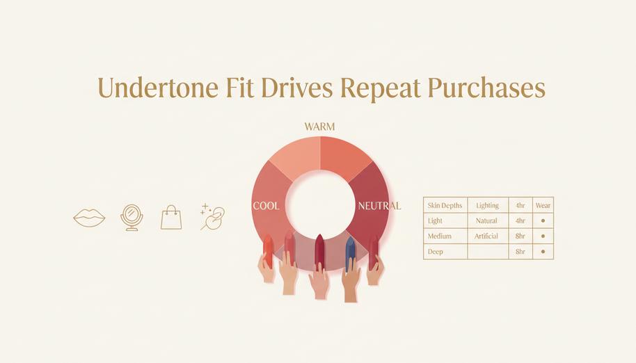
Learning how to choose the perfect lipstick color starts with undertone fit: a shade that works with skin rather than fighting it. Better color matching can make everyday wear feel easier, helping shoppers find lipstick colors worth buying again.
Warm Undertones
For warm skin, how to choose the perfect lipstick color comes down to shades that echo natural golden, yellow, or olive tones without turning dull.
-
Warm shade families
- Everyday choices: peach, coral, and soft earthy nudes can create an easy, lively finish.
- Stronger looks: terracotta, orange-red, and bronze-leaning colors add depth without an obvious cool cast.
-
Before approving a formula
- Swatch it on several warm skin depths.
- Compare indoor and daylight color.
- Check payoff after the lipstick sets.
A good lipstick color should stay recognizable on the lips, not shift into an unexpected pink or gray.
Cool Undertones
Cool complexions often pair naturally with pink, blue-based red, purple, and mauve pigments. The trick is keeping color lively rather than overly icy.
| Screening measure | Target 1 | Target 2 |
|---|---|---|
| Skin depths tested | 3 | 6 |
| Lighting conditions | 2 | 3 |
| Wear checks | 4 hr | 8 hr |
These are practical formulation-testing targets, not consumer-performance statistics.
- Soft look: try cool pink or mauve.
- Rich look: move toward berry, plum, or fuchsia.
Testing several skin depths helps brands choose lipstick shades with fewer nasty surprises after purchase.
Neutral Undertones
Knowing how to choose the perfect lipstick color is especially flexible for neutral skin because neither warmth nor coolness clearly dominates.
-
Build the core range.
- Keep beige, taupe, greige, and nude colors genuinely balanced.
- Add rose, red, and berry options for more impact.
-
Check real-life versatility.
- A versatile shade should work across common lighting conditions.
- A so-called universal lipstick still needs testing across varied skin depths.
That broader choice makes finding the perfect lipstick shade less of a guessing game and supports dependable everyday-to-statement options.
Is Matte Or Satin Finish Right For You?
Learning how to choose the perfect lipstick color also means deciding how that color should look and feel on the lips. Finish changes shine, comfort, color impact, and wear time. For brands exploring different textures, Topfeel Beauty supports formulation development for matte and satin options, assisting with texture and color payoff requirements without unnecessary guesswork.
Matte Finish
Matte works well when a lipstick color needs strong visual impact with minimal reflection. Its opaque, non-shiny surface can make a bold color appear especially intense.
-
Formula priorities
-
Color payoff
- Higher pigment loading supports a bold, flat appearance.
- A velvety texture can soften the visual effect without adding gloss.
-
Wear experience
- Waxes and film-forming polymers help create long-wearing color and better transfer resistance.
- Balanced emollients reduce an overly dry-feel finish. Nobody wants lips feeling like cardboard.
-
| Matte formula factor | Typical test range | Practical target |
|---|---|---|
| Pigment load | 12–25% | 18% |
| Wax content | 10–20% | 15% |
| Emollients | 20–40% | 30% |
| Polymer content | 2–8% | 5% |
| Gloss reading at 60° | 1–10 GU | ≤5 GU |
For how to choose the perfect lipstick color, remember that matte finishes can make deep reds, berries, and browns look richer. A perfect lipstick color still needs enough comfort for real-world wear.
Satin Finish
Satin sits between matte and gloss, giving lipstick a gentle sheen rather than a glassy surface. The creamy, smooth glide comes largely from oils and emollients, which can create a more hydrating and comfortable feel.
- Choose the lipstick color and check it under natural light.
- Apply one coat; satin formulas are often buildable, so color intensity can rise gradually.
- Check how the luminous, soft-focus finish changes the shade around lip lines.
Learning how to choose the perfect lipstick color becomes easier when finish joins undertone and skin tone in the decision. Satin is a handy pick for consumers seeking richer color with forgiving shine, easy application, and day-to-day comfort.
Packaging Impact: Color Names That Convert
Lipstick naming has to catch the eye and still make shade choice easy. Learning how to choose the perfect lipstick color starts with names that connect emotion, useful color clues, and fresh beauty language.
Evocative Emotion Names for Higher Engagement
A shade name can turn a basic tube into something shoppers remember. For brands exploring how to choose the perfect lipstick color, emotional naming also gives each option a personality.
-
Build names around feelings customers already recognize.
-
Passion and Desire suit dramatic reds, date-night shades, and rich finishes.
- Keep the wording confident rather than over-the-top.
-
Serenity and Joy feel right for softer everyday colors.
- A light pink called Joy can sound easygoing and wearable.
-
-
Match stronger identities with bolder shades.
- Confidence works naturally with powerful reds or browns.
- Enigma, Whimsy, and Glamour can distinguish playful, mysterious, or polished collections.
For brands exploring packaging options, Topfeel Beauty provides design support to help align external branding and labeling with the product’s identity, so picking a lipstick color feels personal instead of confusing.
Descriptive Shade Labels That Aid Color Matching
Creative names are catchy, but practical shade clues help shoppers choose a lipstick color without seeing it in person.
- Pair the name with familiar color language: warm caramel Nude, dusty Mauve, cool Berry, or bright Coral.
- Add undertone or depth where useful. A blue-based Red tells shoppers more than a clever name alone.
- Keep familiar shade families visible. Soft Pink, warm Brown, and deep Plum make online comparison a whole lot easier.
This mix answers the practical side of how to choose the perfect lipstick color: shoppers can quickly judge hue, depth, and warm, cool, or neutral undertones.
Trendy Palette Naming to Ride Social Media Trends
Trend language can boost discovery, but names need enough staying power to survive next season.
-
Start with the collection’s social identity.
-
Aesthetic and Vibe can frame a coordinated palette.
- Pair them with lasting color descriptions rather than short-lived jokes.
-
-
Add beauty terms people can share naturally.
- Glow, Chic, and Luxe suggest finish or style.
- Iconic can support a signature hero shade.
-
Use fast-moving language lightly.
-
Viral may fit a limited drop, while Mood has broader staying power.
- That balance keeps lipstick color names current without making packaging feel dated too soon.
-
Retail Launch With Five Signature Hues
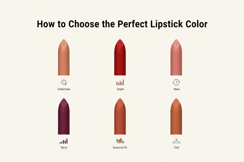
A five-color launch works best when every shade has a clear job yet still feels related to the full range. Learning how to choose the perfect lipstick color means weighing undertone, depth, comfort, and real-life wear—not simply chasing trends. Smart color selection also keeps a cosmetic collection useful across seasons and customer preferences.
Everyday Nude: Versatile for Multiple Skin Tones
For everyday wear, a nude lipstick needs enough contrast to avoid looking washed out. That makes how to choose the perfect lipstick color a practical testing question.
-
Build the versatile shade around:
-
Undertone
- Balance warm, cool, and neutral notes.
-
Depth
- Swatch on varied complexions for genuine skin tone compatibility.
-
The resulting signature hue gives a private label range flexible color selection.
Bold Red: A Power Statement for Modern Lifestyles
A bold red earns its place through pigment and wear.
-
Define the signature shade as a recognizable classic color.
- Keep saturation high for a strong power statement.
- Check comfort and transfer resistance for a modern lifestyle.
-
Test the finished cosmetic product.
- When considering how to choose the perfect lipstick color, balance confidence with broad private label appeal.
Soft Pink: Seasonal Spring Palette Favorite
Soft pink can anchor a spring palette without feeling stuck in one season.
-
Tone:
- Keep the delicate shade wearable.
- Adjust value so the seasonal favorite does not turn chalky.
-
Range:
- Connect the signature hue naturally with the wider color collection and current cosmetic trend needs for private label retail.
Deep Berry: Emerging Color Family for Fall
A deep berry brings rich color to a fall collection, but darker pigments expose patchiness quickly.
-
Control:
-
Saturation
- Keep the seasonal shade deep without muddying its signature hue.
-
Performance
- Test dispersion and fading carefully.
-
That practical check helps explain how to choose the perfect lipstick color within an emerging trend, especially for a private label cosmetic family.
Warm Terracotta: Trending Shade with High Chroma
Warm terracotta mixes orange-brown warmth with high chroma, meaning strong color purity.
-
Color direction:
- Preserve flattering warmth.
- Maintain purposeful color intensity.
-
Production:
- Verify stability at scale.
- Keep the trending shade consistent across private label batches.
The goal is cosmetic innovation that feels current rather than loud, giving the final signature hue a clean modern aesthetic.
References
- Circana reported 2025 U.S. prestige beauty sales – chaindrugreview.com / Chain Drug Review
- brand recognition – blog.hubspot.com / HubSpot
- consumer demographics – blog.hubspot.com / HubSpot
- trend analysis – blog.hubspot.com / HubSpot
- pigment concentration – cosmeticsandtoiletries.com / Cosmetics & Toiletries
- Color theory – canva.com / Canva
- wear time – harpersbazaar.com / Harper’s BAZAAR
- transfer resistance – cosmeticsbusiness.com / Cosmetics Business
- warm skin – cosmopolitan.com / Cosmopolitan
- Cool complexions – cosmopolitan.com / Cosmopolitan
- neutral skin – cosmopolitan.com / Cosmopolitan
- pigment dispersion – cosmeticsandtoiletries.com / Cosmetics & Toiletries
- Matte – cosmopolitan.com / Cosmopolitan
Post time: Aug-19-2026